Bluish
Bluish is a digital design studio run by Dulcie Fulton. I've been creating refreshingly simple websites & brand identities since 1996. I can make something lovely for you too. Please get in touch for a chat.

The British Printing Society
A content-managed website for a long-standing society of printers. The old website was sprawling and often confusing. Built with Craft CMS, the new pared-down website is aimed at encouraging new members to join, with a focus on clarity of information and ease of navigation.

Leominster Museum — The Leominster People Project
Leominster Museum asked me to add a section to their existing WordPress website to showcase their 2023 'Leominster People' exhibition. You can browse/filter notable people with connections to Leominster and read their fascinating stories.

Harriet Love Stained Glass
A clean and simple Shopify e-commerce website for a stained glass artist. The distinctive shapes and sizes of her pieces became an important part of the navigation.

Harriet Love Stained Glass
Harriet's signature stained glass arch shape and her pleasingly geometric initials immediately brought to mind this simple idea for her visual identity.

Pulse Fitness & Wellbeing
A clean, spacious and simple website for a personal trainer and wellbeing coach.
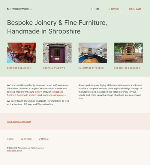
MB Woodworks
An understated and minimal website showcasing the beautiful handcrafted work of this local bespoke joinery firm.
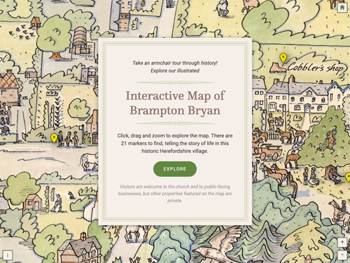
Brampton Bryan interactive map
Take an armchair tour through history! An interactive map with beautiful illustrations by local artist Katy Alston. Part of a heritage interpretation project funded by the National Lottery Heritage Fund.
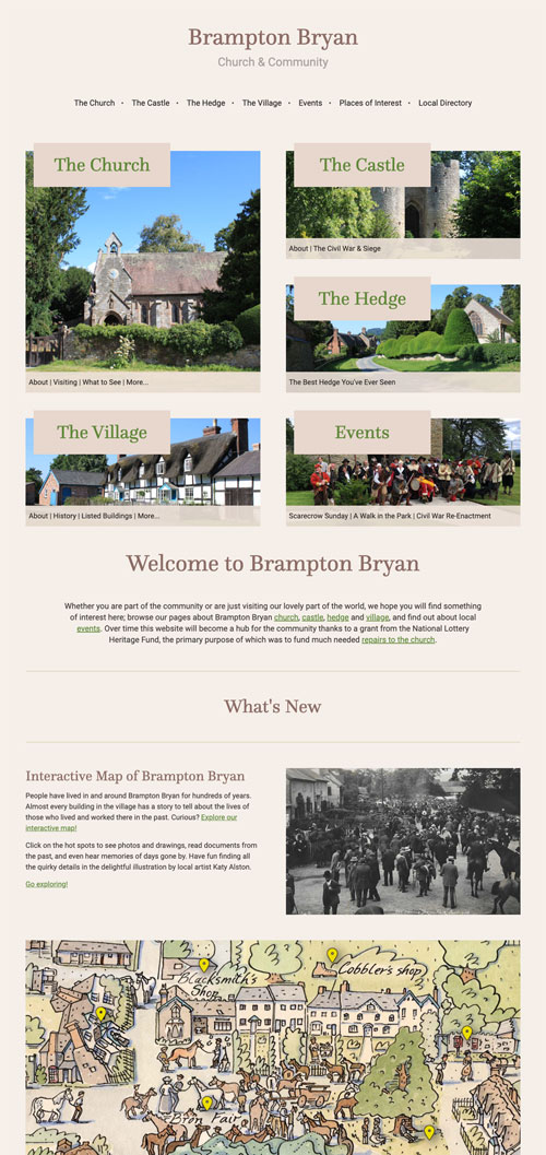
Brampton Bryan village
A simple website for Brampton Bryan church and community. Part of a heritage interpretation project funded by the National Lottery Heritage Fund.
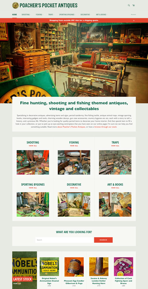
Poacher's Pocket Antiques
A Shopify e-commerce website for a dealer who specialises in fine hunting, shooting and fishing themed antiques, vintage and collectables. Some products can be bought off the shelf, and some oversize/heavy items are enquiry only.
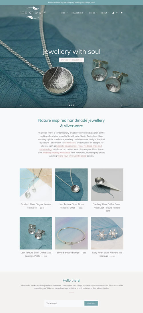
Louise Mary Designs
An elegant Shopify e-commerce website for a jeweller and silversmith. The website sells products but also workshops and commissions. The making process is an important part of the story.
Louise Mary Designs
A nature-inspired identity for jeweller and silversmith Louise Mary Designs. The leaf is a recurring theme in Louise's delicate work.
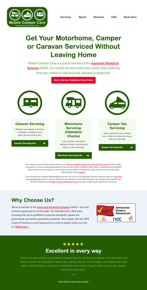
Mobile Camper Care
An SEO-focussed website for a mobile caravan engineer. With top Google rankings for key terms, 85% of traffic now comes from organic search instead of having to pay for Google ads. Mobile Camper Care are always fully booked.
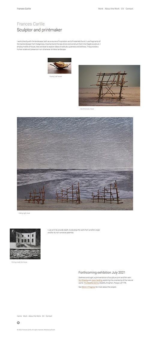
Frances Carlile
A suitably minimal website for a sculptor and printmaker. Clean and pared right back, each page is carefully laid out to reflect the temperature and voice of the work. This project was an absolute joy to work on.
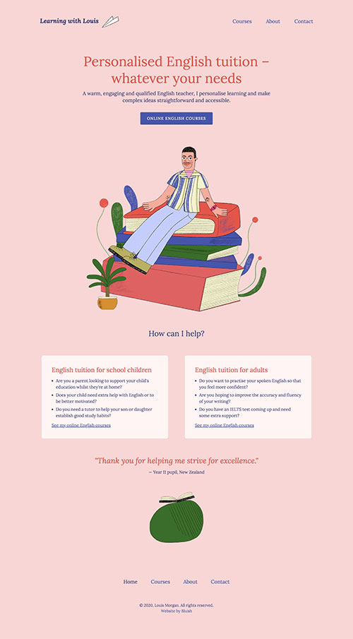
Learning With Louis
A colourful responsive website for a Cardiff-based English tutor offering online English courses for children and adults. The fabulous illustrations are by Aysha Tengiz. No longer live.
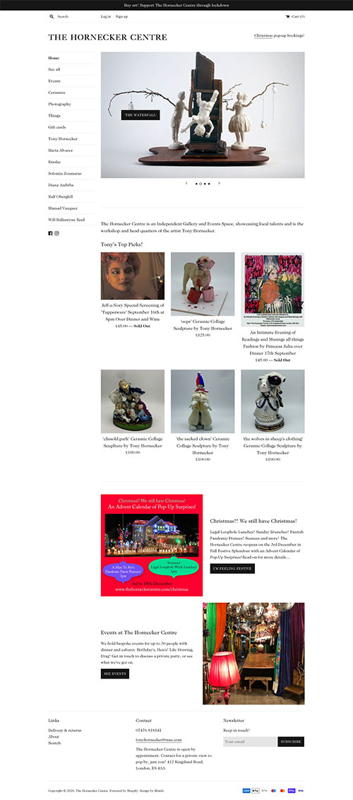
The Hornecker Centre
An online shop built on Shopify for artist Tony Hornecker's new gallery. It's styled to sit happily alongside his artist website (also designed by me).
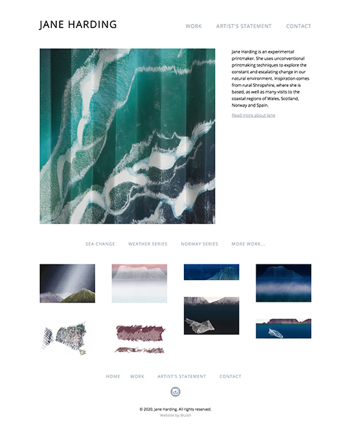
Jane Harding
A minimal website for an experimental artist and printmaker, designed to show her work to best advantage and project it in a simple way.
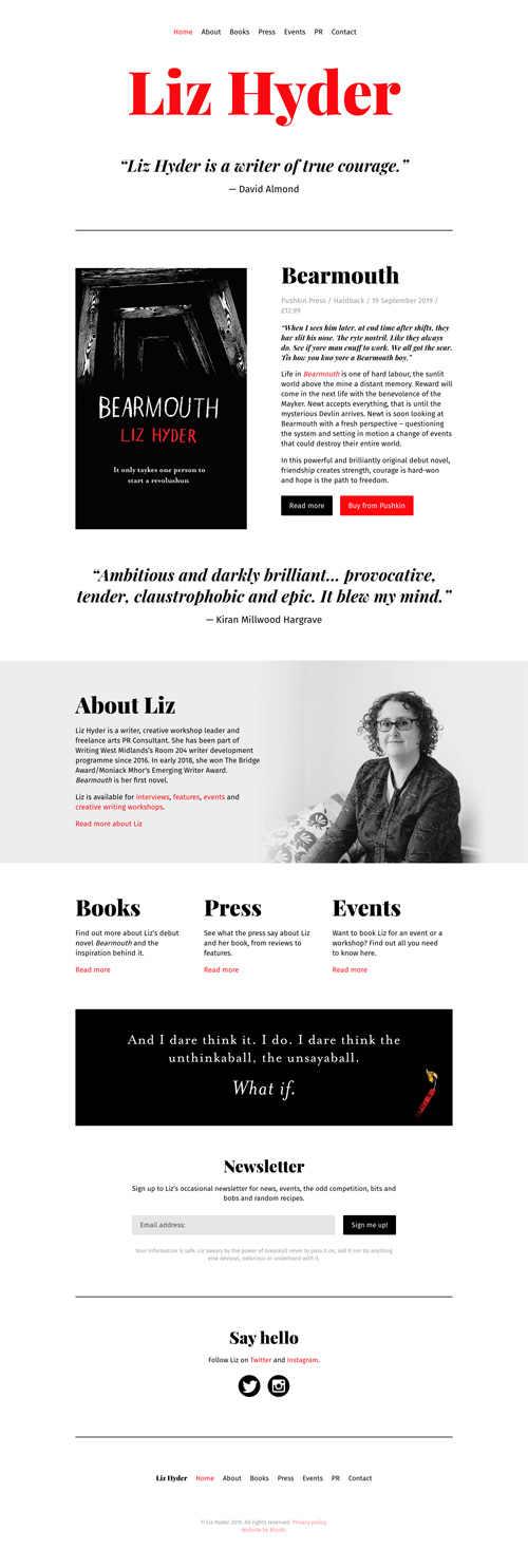
Liz Hyder
Clean, crisp and simple responsive website for award-winning author Liz Hyder. I also designed an email newsletter template to match.
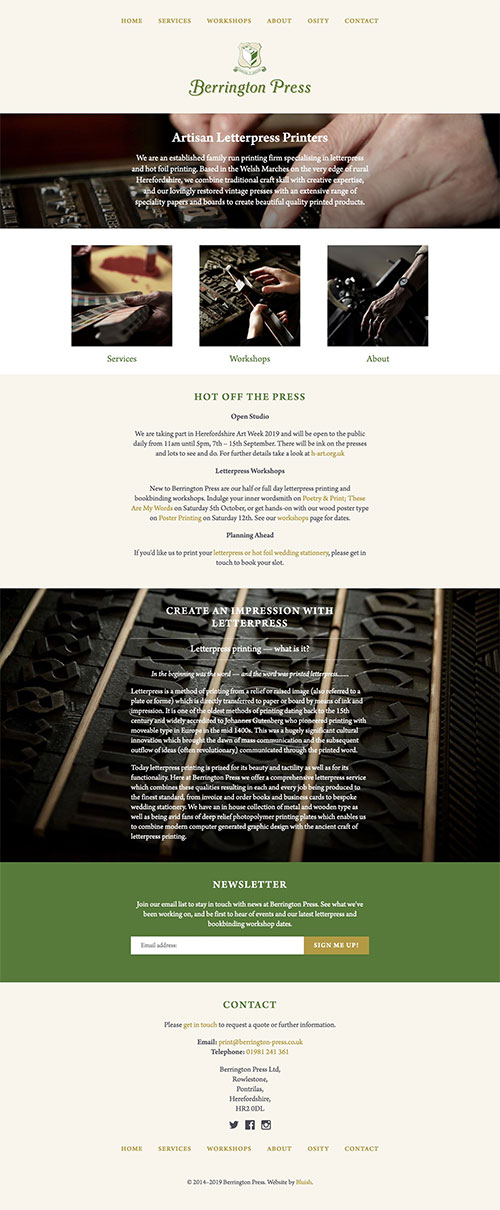
Berrington Press
A responsive website for this family-run artisan letterpress and hot foil traditional printers in Herefordshire.

The Cat's Whiskers Coach
An illustration-led identity, website and supporting graphics for a personal and professional coach. The illustrations are by the brilliant Aysha Tengiz.

Save Mortimer Forest
A logo for a grass-roots local campaign to save our forest from a holiday development. I inked up and letterpress printed some wood type for the wording and also for the textures (made by printing the backs of very large wood type) used on the trees.
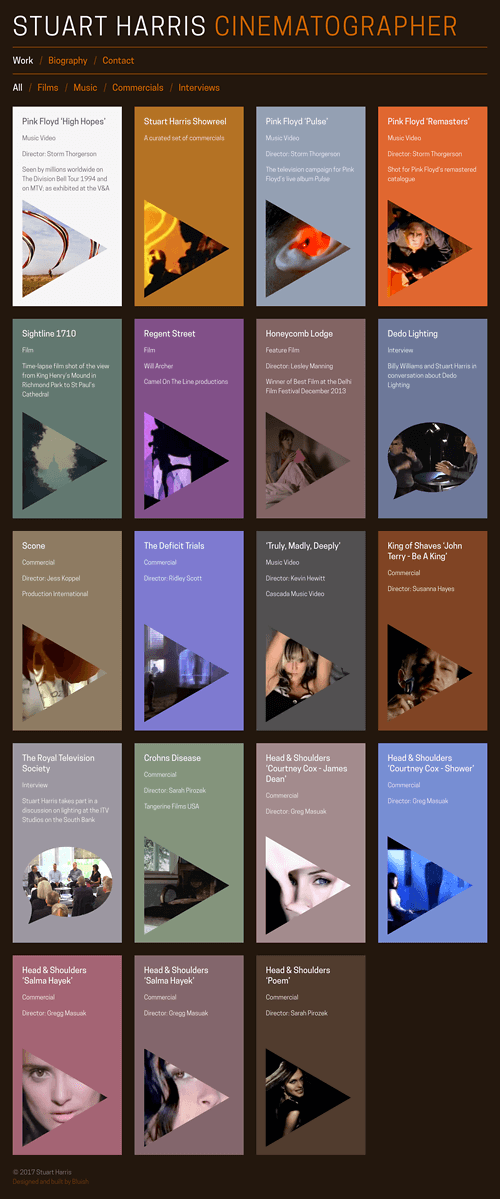
Stuart Harris Cinematographer
A responsive website showing off Stuart's distinctive film, music and commercial cinematography. Within a minimal layout that flexes and changes to suit all device sizes, coloured panels reflect the mood of the work. Icons distinguish video from interviews. Filtering lets you hone in on the things you most want to see.

The Send
A modular, mutable identity for a climbing and bouldering startup. Shown here is the social (square) version.
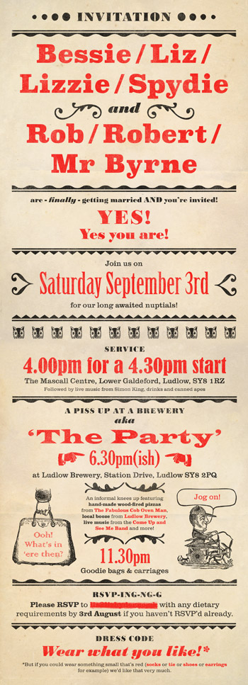
Liz & Rob wedding invitation
A "Circus-y, fun Victorian type thing" for these two lovely, unconventional, funny people. Though not letterpress printed (alas, too tight a deadline), the invitation uses typefaces that were available as wood or metal type. I used the typographic scale for a sense of authenticity.
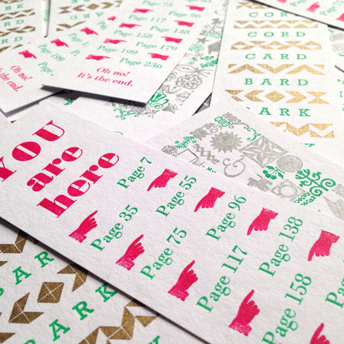
Hay Festival letterpress bookmarks
With my Mostly Flat hat on, I ran a series of letterpress workshops at Hay Festival 2016. Attendees printed the second colour onto three different designs, all set by hand with metal type and ornament.
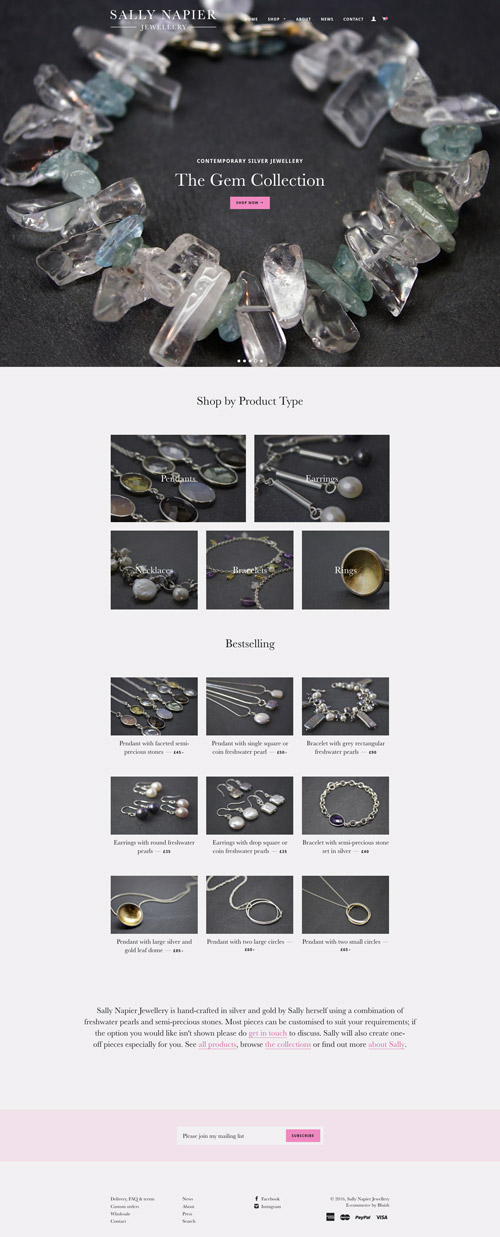
Sally Napier Jewellery
A responsive Shopify e-commerce website for a contemporary silver jeweller. Browse by product type or range. Built using a Shopify template which was restyled and modified to suit brand & project requirements.

Eclectic Sofa letterpress beer mats
Since The Eclectic Sofa was a drinks night, it made sense to print some beer mats. They were dual purpose; they made the group easy to spot in the pub, and they were a good promo tool too.
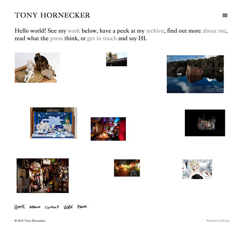
Tony Hornecker
A responsive website for internationally renowned artist and set designer Tony Hornecker. With vast amounts of stunning imagery alongside video and text the challenge was to make an immersive and visually rich experience that encourages in-depth browsing.
Annie Garthwaite Communications
A bold brand identity for this no-nonsense marketing communications consultant. I also designed & produced associated printed and digital collateral.
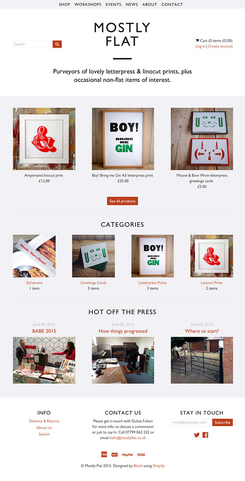
Mostly Flat
My adventures with letterpress. An e-commerce website built with a totally custom Shopify theme.
Eclectic Sofa
A logo for the twice monthly get-together for local creative folk that I co-founded in March 2013. Hand-set with mismatching old wood type and letterpress printed.
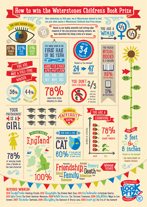
Waterstones Children's Book Prize infographic
Illustrative infographic commissioned by Riot Communications. It shows the likely traits of a winner based on data culled from a highly scientific questionnaire which polled previous winners.
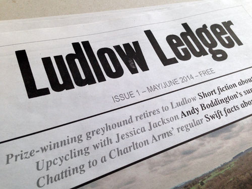
Ludlow Ledger
A letterpress logo and masthead for Ludlow's newspaper of craftfolk, culture, history and landscape. Sadly, Ludlow Ledger is no longer published.
Mostly Flat
Logo for my letterpress sideline where I hand-set metal and wood type the traditional way and print tactile paper goods on my vintage treadle platen press.
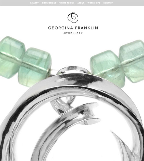
Georgina Franklin Jewellery
Responsive website for designer maker specialising in bespoke handcrafted silver jewellery. A clean, minimal design with lots of white space to set off the work. Fullscreen slideshows add richness and narrative.
Georgina Franklin Jewellery
Brand identity for designer maker specialising in bespoke handcrafted silver jewellery.

Eastern Cathedrals
Brand identity, under direction from Bridging Unit, for a group of cathedrals in the East of England.
