Bluish
Bluish is a digital design studio run by Dulcie Fulton. I've been creating refreshingly simple websites & brand identities since 1996. I can make something lovely for you too. Please get in touch for a chat.

Harriet Love Stained Glass
Harriet's signature stained glass arch shape and her pleasingly geometric initials immediately brought to mind this simple idea for her visual identity.
Louise Mary Designs
A nature-inspired identity for jeweller and silversmith Louise Mary Designs. The leaf is a recurring theme in Louise's delicate work.

The Cat's Whiskers Coach
An illustration-led identity, website and supporting graphics for a personal and professional coach. The illustrations are by the brilliant Aysha Tengiz.
Save Mortimer Forest
A logo for a grass-roots local campaign to save our forest from a holiday development. I inked up and letterpress printed some wood type for the wording and also for the textures (made by printing the backs of very large wood type) used on the trees.

The Send
A modular, mutable identity for a climbing and bouldering startup. Shown here is the social (square) version.

Annie Garthwaite Communications
A bold brand identity for this no-nonsense marketing communications consultant. I also designed & produced associated printed and digital collateral.
Eclectic Sofa
A logo for the twice monthly get-together for local creative folk that I co-founded and ran from March 2013-2020. Hand-set with mismatching old wood type and letterpress printed.
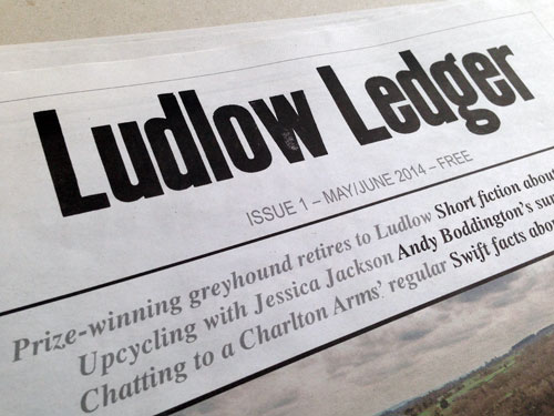
Ludlow Ledger
A letterpress logo and masthead for Ludlow's newspaper of craftfolk, culture, history and landscape. Sadly, Ludlow Ledger is no longer published.
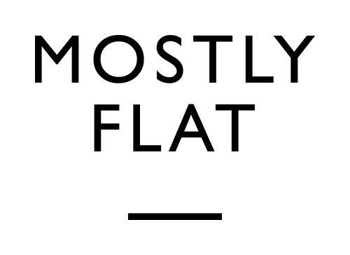
Mostly Flat
Logo for my letterpress sideline where I hand-set metal and wood type the traditional way and print tactile paper goods on my vintage treadle platen press.

Georgina Franklin Jewellery
Brand identity for designer maker specialising in bespoke handcrafted silver jewellery.

Eastern Cathedrals
Brand identity, under direction from Bridging Unit, for a group of cathedrals in the East of England.
