Bluish
Bluish is a digital design studio run by Dulcie Fulton. I've been creating refreshingly simple websites & brand identities since 1996. I can make something lovely for you too. Please get in touch for a chat.
Save Mortimer Forest
A logo for a grass-roots local campaign to save our forest from a holiday development. I inked up and letterpress printed some wood type for the wording and also for the textures (made by printing the backs of very large wood type) used on the trees.
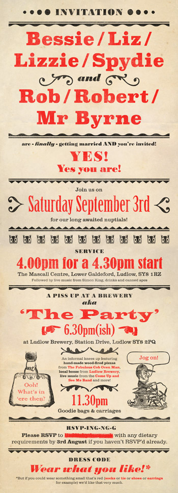
Liz & Rob wedding invitation
A "Circus-y, fun Victorian type thing" for these two lovely, unconventional, funny people. Though not letterpress printed (alas, too tight a deadline), the invitation uses typefaces that were available as wood or metal type. I used the typographic scale for a sense of authenticity.
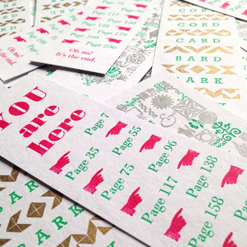
Hay Festival letterpress bookmarks
With my Mostly Flat hat on, I ran a series of letterpress workshops at Hay Festival 2016. Attendees printed the second colour onto three different designs, all set by hand with metal type and ornament.

Eclectic Sofa letterpress beer mats
Since The Eclectic Sofa was a drinks night, it made sense to print some beer mats. They were dual purpose; they made the group easy to spot in the pub, and they were a good promo tool too.
Eclectic Sofa
A logo for the twice monthly get-together for local creative folk that I co-founded in March 2013. Hand-set with mismatching old wood type and letterpress printed.
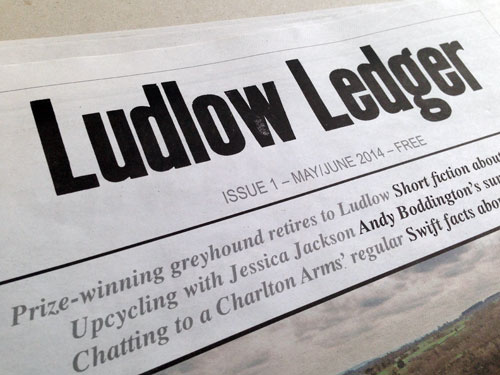
Ludlow Ledger
A letterpress logo and masthead for Ludlow's newspaper of craftfolk, culture, history and landscape. Sadly, Ludlow Ledger is no longer published.
Mostly Flat
Logo for my letterpress sideline where I hand-set metal and wood type the traditional way and print tactile paper goods on my vintage treadle platen press.